This page allows for the on-line reproduction (and some extras) of the figures in the paper: Peyron, F., Lobry, J.R., Musset, K., Ferrandiz, J., Gomez-Marin, J.E., Petersen, E., Meroni, V., Rausher, B., Mercier, C., Picot, S., Cesbron-Delauw, M.-F. (2006) Serotyping of Toxoplasma gondii in chronically infected pregnant women: predominance of type II in Europe and types I and III in Columbia (South America). Microbes and Infections, 8:2333-2340.
Acknowledgements: We thank Marie-Laure Darde, Pierre Marty, Hervé Pelloux, Philippe Thulliez for providing genotyped sera and Marie-Laure Darde for helpful advices.
Abstract: Toxoplasma gondii, responsible of a wide range of clinical manifestations is grouped into three clonal lineage of different virulence in mice. Yet, it is not clear whether genotypic pattern is associated with clinical profile of the disease in humans and neither is the geographical distribution known. The main reason is the difficulty to obtain parasitic DNA from patients. Hence, data are limited and originate from acute or congenital infections or animals. For addressing the question of type strain, geographical distibution and severity of clinical toxoplasmosis, a non invasive assay is needed. We developed an ELISA test for serotyping Toxoplasma gondii strains using polymorphic peptides specific of the 3 clonal lineages derived from GRA5 and GRA6, 2 dense granule organelles. Two hundred and fifty two sera from chronically infected pregnant women from 3 different European countries and Colombia were investigated. The analysis of genotype-specific antibody response showed a homogenous type II structure in the European samples and a type I and III in the Colombian population. Our data are in accordance to what has already been reported with genotyping strains from Europe and South America. We demonstrated that, despite some limitation due to antigen/antibody specificity, serotyping is a promising assay for investigating relationship between type of strain and state of the disease.
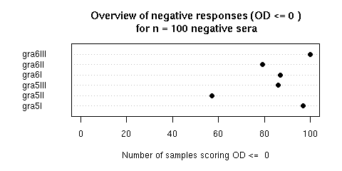
Figure 2 was an overview of negative responses (OD = 0) for n = 100 negative sera. In a perfect world we should have 100 % of negative responses. What was observed is here and depicted bellow. To reproduce the figure, just click on the "Do it again" button. Note that in the paper we repported the results in an extremely conservative way since we used the most stringent threshold value possible: 0.00 (i.e. bellow the detection level). The R sript thereafter is editable, so that you can play with the threshold value to see what's happen with a less stringent value. Try for instance to set its value to 0.05 and then click on the "Do it again" button to see that we are not so far from a perfect world.
Figure 3 showed serotyping results for strains with a known genotype: type I (n = 8) type II (n = 23) type III (n = 3). The results are here and depicted bellow. Just click on the "Do it again" button to reproduce the figure in the paper. This is a Box-and-whisker plot representation of the observed distributions of the optical densities. The median of the distribution is given by the vertical black line. The grey box extends horizontally from the first to the third quartile of the distribution so that 50 % of observations are within the grey box. The grey boxes vertical widths are proportional to the square-roots of the number of observations in the groups. The whiskers extend to the most extreme data point which is no more than 1.5 times the interquartile range from the box. Points outside the interwhisker range are considered are outliers and then plot explicitly (we have two outliers here, one for GRA5II and one for GRA5I). The definition of outliers is of course somewhat arbitrary, we have used in the paper the default value 1.5 for the range parameter in the boxplot function. Again, the R script thereafter is editable so that you can play with this parameter. You can try for instance to set its value to 1.0 and see a new outlier for GRA6II by clicking on the "Do it again" button.
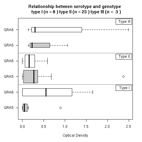
Figure 4 showed the results obtained with natural human populations from various geographical origins Fr = France (n = 93), DK = Denmark (n = 59), It = Italy (n = 60), Col = Colombia (n = 40). The old world dataset is here and the new world dataset is here. To reproduce the figure from the paper just click on the "Do it again" button. This figure (a mosaic plot) is a straightforward way of displaying contingency tables: the surface of each rectangle in the plot is proportional to observed counts. In addition, a color code outlines the cases that contibute to the rejection of independency for Fisher's chi-square test. The new-world results are then differents from the old-world results. In the paper we conservatively used high threshold values for Gra 6I and Gra 6III (OD > 0.5). You can repeat the analysis with different thresholds values by seting them to your choice in the R script thereafter and then cliking on the "Do it again" button (note that the figure title won't be adapted and will stay to its default).
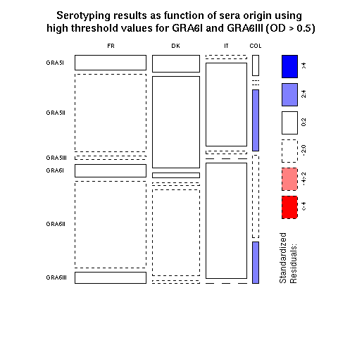
For people unfamilar with mosaic plot representations of contingency tables, a good starting point is to consider what would be obtained under the null hypothesis of independence. In our case, what would be obtained if the serotyping results were completely independent of the geographical origin of sera? This is depicted just thereafter:
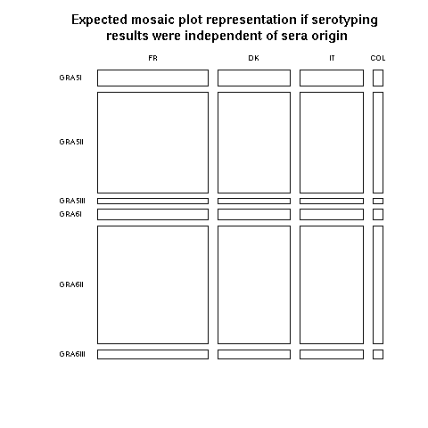
Horizontally, the widths of rectangles are proportionnals to the number of observation in each geographical locatation: we have more data from France than from Denmark than from Italy than from Columbia. Vertically, the heights of rectangles are proportionnals to the number of observations for each peptide: we have more data for GRA6II than for GRA5II, and so on... Consider now the small bottom right rectangle for GRA6III and Columbia. Under the independence hypothesis, as represented here, this is a very small rectangle because GRA6III and Columbia are not very common. Turning back to the previous plot with actual data, the bottom right rectangle is much bigger and its blue color means that there is a significant excess of GRA6III in Columbia as compared to what would be obtained under the null hypothesis. Mosaic plots are then a very efficient way to detect anomalies in a contingency table. More on mosaic plots and their extensions can be found in Michael Friendly's Home page.