![]()
Copyright 2016 Dean Attali. Licensed under the MIT license.
ggExtra is a collection of functions and layers to
enhance ggplot2. The flagship function is ggMarginal, which
can be used to add marginal histograms/boxplots/density plots to ggplot2
scatterplots. You can view a live
interactive demo to test it out!
Most other functions/layers are quite simple but are useful because they are fairly common ggplot2 operations that are a bit verbose.
This is an instructional document, but I also wrote a blog post about the reasoning behind and development of this package.
Note: it was brought to my attention that several years ago there was
a different package called ggExtra, by Baptiste (the author
of gridExtra). That old ggExtra package was
deleted in 2011 (two years before I even knew what R is!), and this
package has nothing to do with the old one.
ggExtra is available through both CRAN and GitHub.
To install the CRAN version:
install.packages("ggExtra")To install the latest development version from GitHub:
install.packages("devtools")
devtools::install_github("daattali/ggExtra")ggExtra comes with an addin for
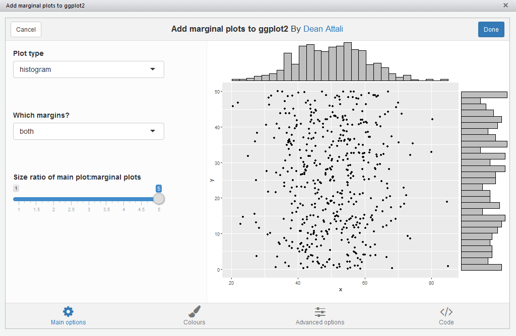
ggMarginal(), which lets you interactively add marginal
plots to a scatter plot. To use it, simply highlight the code for a
ggplot2 plot in your script, and select ggplot2 Marginal Plots
from the RStudio Addins menu. Alternatively, you can call the
addin directly by calling ggMarginalGadget(plot) with a
ggplot2 plot.
We’ll first load the package and ggplot2, and then see how all the functions work.
library("ggExtra")
library("ggplot2")
ggMarginal
- Add marginal histograms/boxplots/density plots to ggplot2
scatterplotsggMarginal() is an easy drop-in solution for adding
marginal density plots/histograms/boxplots to a ggplot2 scatterplot. The
easiest way to use it is by simply passing it a ggplot2 scatter plot,
and ggMarginal() will add the marginal plots.
As a simple first example, let’s create a dataset with 500 points where the x values are normally distributed and the y values are uniformly distributed, and plot a simple ggplot2 scatterplot.
set.seed(30)
df1 <- data.frame(x = rnorm(500, 50, 10), y = runif(500, 0, 50))
p1 <- ggplot(df1, aes(x, y)) + geom_point() + theme_bw()
p1
And now to add marginal density plots:
ggMarginal(p1)
That was easy. Notice how the syntax does not follow the standard
ggplot2 syntax - you don’t “add” a ggMarginal layer with
p1 + ggMarginal(), but rather ggMarginal takes the object
as an argument and returns a different object. This means that
you can use magrittr pipes, for example
p1 %>% ggMarginal().
Let’s make the text a bit larger to make it easier to see.
ggMarginal(p1 + theme_bw(30) + ylab("Two\nlines"))
Notice how the marginal plots occupy the correct space; even when the main plot’s points are pushed to the right because of larger text or longer axis labels, the marginal plots automatically adjust.
If your scatterplot has a factor variable mapping to a colour (ie.
points in the scatterplot are colour-coded according to a variable in
the data, by using aes(colour = ...)), then you can use
groupColour = TRUE and/or groupFill = TRUE to
reflect these groupings in the marginal plots. The result is multiple
marginal plots, one for each colour group of points. Here’s an example
using the iris dataset.
piris <- ggplot(iris, aes(Sepal.Length, Sepal.Width, colour = Species)) +
  geom_point()
ggMarginal(piris, groupColour = TRUE, groupFill = TRUE)
You can also show histograms instead.
ggMarginal(p1, type = "histogram")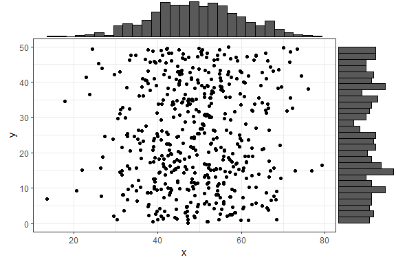
There are several more parameters, here is an example with a few more
being used. Note that you can use any parameters that the
geom_XXX() layers accept, such as col and
fill, and they will be passed to these layers.
ggMarginal(p1, margins = "x", size = 2, type = "histogram",
           col = "blue", fill = "orange")
In the above example, size = 2 means that the main
scatterplot should occupy twice as much height/width as the margin plots
(default is 5). The col and fill parameters
are simply passed to the ggplot layer for both margin plots.
If you want to specify some parameter for only one of the marginal
plots, you can use the xparams or yparams
parameters, like this:
ggMarginal(p1, type = "histogram", xparams = list(binwidth = 1, fill = "orange"))
Last but not least - you can also save the output from
ggMarginal() and display it later. (This may sound trivial,
but it was not an easy problem to solve - see
this discussion).
p <- ggMarginal(p1)
p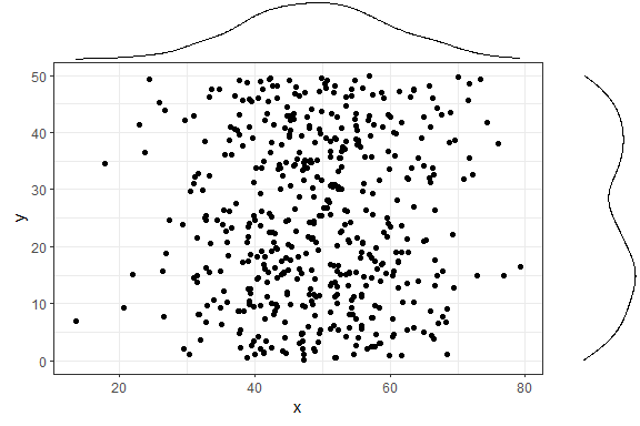
You can also create marginal box plots and violin plots. For more
information, see ?ggExtra::ggMarginal.
ggMarginal() in R Notebooks or RmarkdownIf you try including a ggMarginal() plot inside an R
Notebook or Rmarkdown code chunk, you’ll notice that the plot doesn’t
get output. In order to get a ggMarginal() to show up in an
these contexts, you need to save the ggMarginal plot as a variable in
one code chunk, and explicitly print it using the grid
package in another chunk, like this:
```{r}
library(ggplot2)
library(ggExtra)
p <- ggplot(mtcars, aes(wt, mpg)) + geom_point()
p <- ggMarginal(p)
```
```{r}
grid::grid.newpage()
grid::grid.draw(p)
```
removeGrid
- Remove grid lines from ggplot2This is just a convenience function to save a bit of typing and memorization. Minor grid lines are always removed, and the major x or y grid lines can be removed as well (default is to remove both).
removeGridX is a shortcut for
removeGrid(x = TRUE, y = FALSE), and
removeGridY is similarly a shortcut for…
df2 <- data.frame(x = 1:50, y = 1:50)
p2 <- ggplot2::ggplot(df2, ggplot2::aes(x, y)) + ggplot2::geom_point()
p2 + removeGrid()
For more information, see ?ggExtra::removeGrid.
rotateTextX -
Rotate x axis labelsOften times it is useful to rotate the x axis labels to be vertical if there are too many labels and they overlap. This function accomplishes that and ensures the labels are horizontally centered relative to the tick line.
df3 <- data.frame(x = paste("Letter", LETTERS, sep = "_"),
                  y = seq_along(LETTERS))
p3 <- ggplot2::ggplot(df3, ggplot2::aes(x, y)) + ggplot2::geom_point()
p3 + rotateTextX()
For more information, see ?ggExtra::rotateTextX.
plotCount
- Plot count data with ggplot2This is a convenience function to quickly plot a bar plot of count
(frequency) data. The input must be either a frequency table (obtained
with base::table) or a data.frame with 2 columns where the
first column contains the values and the second column contains the
counts.
An example using a table:
plotCount(table(infert$education))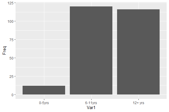
An example using a data.frame:
df4 <- data.frame("vehicle" = c("bicycle", "car", "unicycle", "Boeing747"),
                  "NumWheels" = c(2, 4, 1, 16))
plotCount(df4) + removeGridX()
For more information, see ?ggExtra::plotCount.