Graphical
Interface
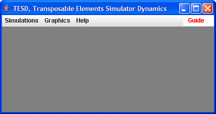
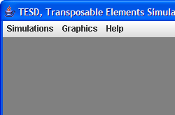
The following screenshot of the main window of TESD, shows three menus: Simulations, Graphics, and Help:
The Simulation menu helps you to select the model or load a setting file, and then run simulations.
The Graphic menu shows the simulation results in three
different representations.
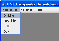
Simulations
This menu contains all the graphical forms you need to set and run simulations:
On
Line
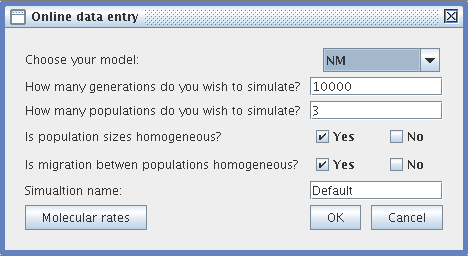
This menu allows you to set the various parameters of the simulation step by step:
- Online data entry :
- Choose your simulation model (NM or LB)
- Specify the duration of the simulation (a positive integer number of generations)
- Specify the number of populations (at least 2)
- Specify if you want the populations all to be equal in size. If not, then specify the size of each population)
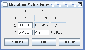
- Decide whether the migration rates between populations are homogeneous (i.e., whether the same number of individuals migrates between populations in each generation). If this is not the case, then specify the migration rates between the populations in a matrix.
- Specify the name of your simulation. To find out more about how files are managed by TESD see Files).
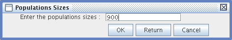
- Population Size: Only integers greater than one are accepted.
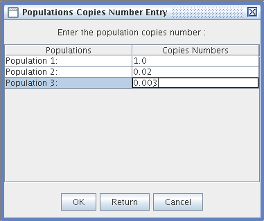
- Population Copy Number Entry: You can enter a number with decimals or a null number of Transposable Element copies for each population.
- Migrations Entry: for variable migration rates,
- Fill in a migration matrix, in which the lines represent the populations from which migrants emigrate, and the columns are the receiving populations. The rates are reciprocal.
- You can save the simulation parameters in a .para file to memorize the settings and use them again with the Input file menu item.
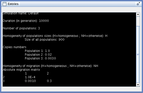
- Entries: a window summarizing all the settings of the current simulation.
Input
file
This item can be used to load a previously-registered simulation parameter file. To find out more about this file see Files.
Run
Once a simulation has been set or loaded, you can run it as many times as you wish. You should be aware that running a simulation can take a long time, since the time taken is proportional to the number of copies of transposable elements, the number and size of populations, the number of generations, etc.
You can allocate more resources on your computer to TESD by running it with the option -Xms128, which initializes the RAM
memory usage to 128 or -Xms256, which sets a maximum RAM value 256. For example:
"java -Xms128 -Xmx256 -jar TESD.jar
Graphics
Four graphics are provided to interpret the results of a simulation:
Curves
When you click on "Curves", a file chooser appears, allowing you to view your computer folders and select a .mea (mean) or .var (variance) file (see Files
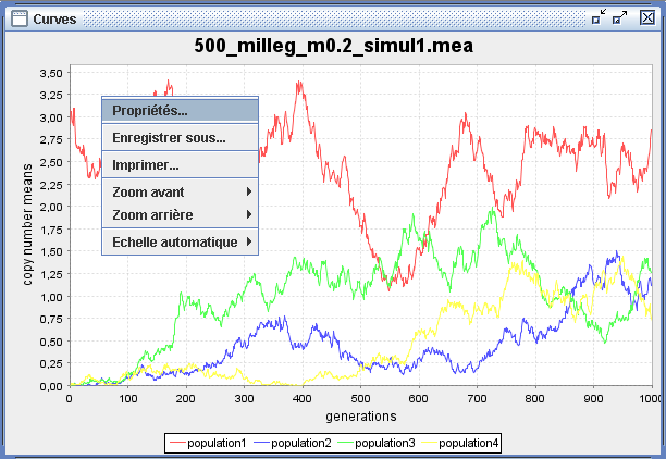
for further details). The "Curves" window, which pops up, tracks the evolution of the transposable element copy number mean (y axis) across generations (x axis) for each population, which are characterized by a distinct color label at the bottom of the graph area. You can zoom by dragging the mouse from the top left corner to the bottom right, and also use many features to customize your graph by clicking with the left button of your mouse in the graph area (Control + click on Mac). This enables you to change the labels or the ranges, export the graph as a picture, etc.
Histograms
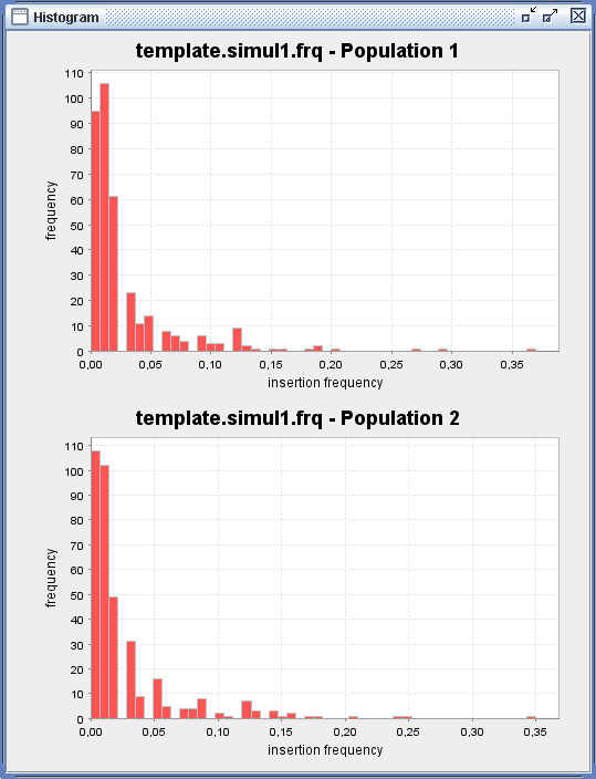
After the simulation, you can obtain the frequencies of transposable element insertions along the chromosomes of individuals.
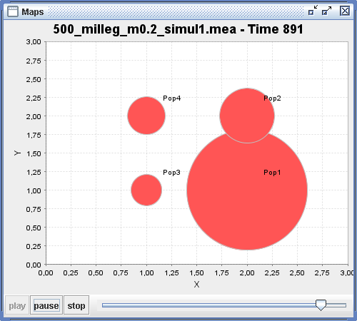
Maps
See Animated Maps, in the next section, for an overview of what this looks like.
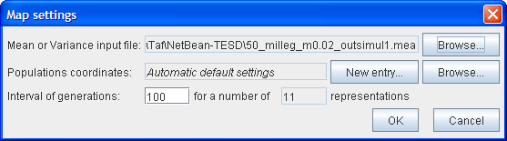
Maps is another more illustrative way of representing the means or variances. Populations are represented on a xy coordinate space as spheres with a diameter proportional to the transposable element copy number at each of the generations of the simulation. For long simulations, you can choose a longer generation interval; a map will then be drawn for each of these generations.
To allow you to set the various parameters, a Mapsettings window appears as follows:
First, choose the .mea or .var file in the text file.
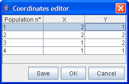
The second line allows you to set the coordinates of the populations on the map by clicking on New Entry. A Coordinates editor then appears which allows you to assign the coordinates. If you are not interested in seeing the populations at specific locations, by default they are placed randomly in an array of possible positions depending on the number of populations.
You can save the coordinates and use them again in a subsequent Map representation by clicking on the Browse button.
Then select the generation interval number and the number of maps you want to see. The default interval is set to draw 11 maps.
Animated
Map
This graphic provides an animated display of the maps.
The scroller can be used to view the map at a specific generation. Press the left or right button to play the animation backwards or forwards.